
Curated Obscurity
An exploration of color, intention, and philosophical contrast.

| On Blue
The explosion of blue in graphic design has been growing for some time, and it’s been a particular focus on my Why So Blue board.
Long before the internet’s recent fascination with a blue sparkling water, I kept noticing deep blues in graphic design, art direction boards, and even pottery. Not as background noise, but as the moment of emphasis.
It made me pause and ask: why does this color keep returning to us?
Blue has long symbolized trust and professionalism within design communities. It’s a safe choice. But lately, I’ve noticed independent designers using bold, saturated blues to provoke and energize. It’s less about trust and more about tension and pop.
This contrast between familiarity and rebellion has long been a design theme that has interested me. The same color once used to soothe is being used for visual impact.


That’s what makes these designs interesting; they don’t just look good, they draw your eye in new ways.
| On Contrast
Beyond color, contrast in design often emerges through its symbolism. One example I’ve been tracking lately is the use of religious and ritualistic imagery in contemporary visual work.
Contrast in design doesn’t always look like disruption, sometimes it’s subtle nods to familiar, or even traditional, themes. These art forms often take shape through contrast, using what’s expected in unexpected ways. That could mean sacred iconography stripped of context, old typography on new formats, or quiet aesthetics in loud spaces (and vice-versa). These small choices push against norms without rejecting them entirely; they subvert through nuance.


These visuals are doing something similar—reclaiming what once felt formal, sacred, or conservative, and twisting it. There’s a tension here; some people are drawn to it instinctively, while others are put off. Either way, it makes you feel something, and that’s something design should always aim to do.
| On Intention
Context is everything, though. A single image can feel reverent or provocative, thoughtful or performative, depending on the intention behind it and the story it's part of.
Tony Matelli’s Weeds explores this tension beautifully, asking:
“What is a weed and what’s a cultivated plant? What is acceptable and unacceptable behavior? What belongs here and not there?… This work presents a spirit embracing rebellious thought — I see it as motivational in that sense — but there is also an aspect of doom in the work. Depending on what the viewer brings to it, it can be both things.”
That’s what I keep coming back to: the small, intentional contrasts that shape how something lands. From the colors you choose to the philosophies that guide you, every decision becomes part of a larger narrative, one that can hold rebellion, quiet beauty, or simply a mood you’re trying to name.
| On Tao
The final philosophical thread running through all of this, for me, pairs closely with my recent reading of the Tao Te Ching—particularly the idea that something can be one thing, another, or both at once.
Chapter 14 (Translated by Gia-Fu Feng and Jane English)
Look, it cannot be seen—it is beyond form.
Listen, it cannot be heard—it is beyond sound.
Grasp, it cannot be held—it is intangible.
These three are indefinable;
Therefore they are joined in one.From above it is not bright;
From below it is not dark:
An unbroken thread beyond description.
It returns to nothingness.
The form of the formless,
The image of the imageless,
It is called indefinable and beyond imagination.Stand before it and there is no beginning.
Follow it and there is no end.
Stay with the ancient Tao,
Move with the present.Knowing the ancient beginning is the essence of Tao.
A whole piece could be written on this passage alone, but I share it here to highlight the theme of obscurity we’ve been circling throughout.
Laozi marvels at the mystery of Tao, the guiding principle behind all things, and how its power lies in its elusiveness. This passage wasn’t written with design or aesthetics in mind, but its application feels natural: it reminds us that not everything needs to be fully grasped to be deeply felt.
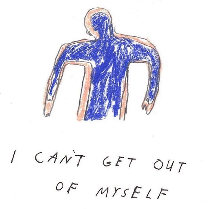
Art often brushes up against that same mystery. It speaks to something unnamed, a feeling only form, color or composition can express. A single visual choice can shift meaning, make the familiar strange, or create a sense of longing we didn’t know we carried. Obscurity, in this context, isn’t a flaw, it's the feature that aims to give shape to the inexpressible. That is the great gift that art gives to us, even in its simplest forms.